Years ago I participated in an online artists community that had a group devoted to my favored medium, oil pastels. That community faded away, but one of the members, a Russian artist, contacted me recently to see if I would like to be profiled in the digital pastel magazine she edits. I said sure, and after much correspondence, answering her questions and sending images, a final piece has appeared. It’s written in Russian. Here’s the first page…
I performed a DIY translation using a Google application, and presto, the English version of the six pages appears below. Unfortunately the formatting and font variety is lost, but at least it’s readable. Thank you to ProstoPastel Magazine and author Margarita Shvetsova.
For a long time I wanted to do a piece which captured my experience as a diver in California kelp beds. Giant kelp is a macro alga which forms dense forests from rocky bottoms to the surface in depths of fifty feet or more. Kelp beds or forests support a rich variety of fishes, invertebrates and other algae. Aside from their biological significance, kelp forests are visually stunning with the green/brown stalks and leaves, shifting shadows, and blue shafts of light penetrating the depths. Their three dimensional complexity can also be a confusing and disorienting environment for a diver. The visual experience and impression of kelp bed diving is what I wished to convey in a painting, but unfortunately I had no personal photograph that was an adequate reference image for such an effort. The idea sat dormant for years. Not long ago I took a photo of living kelp in a public aquarium in Japan and I decided to transform it into an abstract composition that would suit my purpose. The steps were as follows:Create a second version of the image with an altered palate emphasizing cool colors2. Superimpose semi-transparent versions of both images, with one rotated 180 degrees. This constituted my “final” reference image.
1. Select kelp image and create two versions: one in natural colors and another with a blue-green-purple shifted palette. 2. Superimpose semi-transparent versions of the above images with one rotated 180 degrees 3. Pencil sketch the original image 4. Sketch the rotated image over the first sketch 5. Add oil pastel color consistent with the digitally created reference image. 6. The last step was a long process of working with the oil pastels to eventually result in the final painting.
Below are some images selected to represent the steps. The result is a hybrid of my usual representational or realistic style with a more abstract style. I think it captures the colors and movement experienced when diving in a kelp forest.
Aquarium photo of kelp
Final reference after color modification, rotation, and overlay
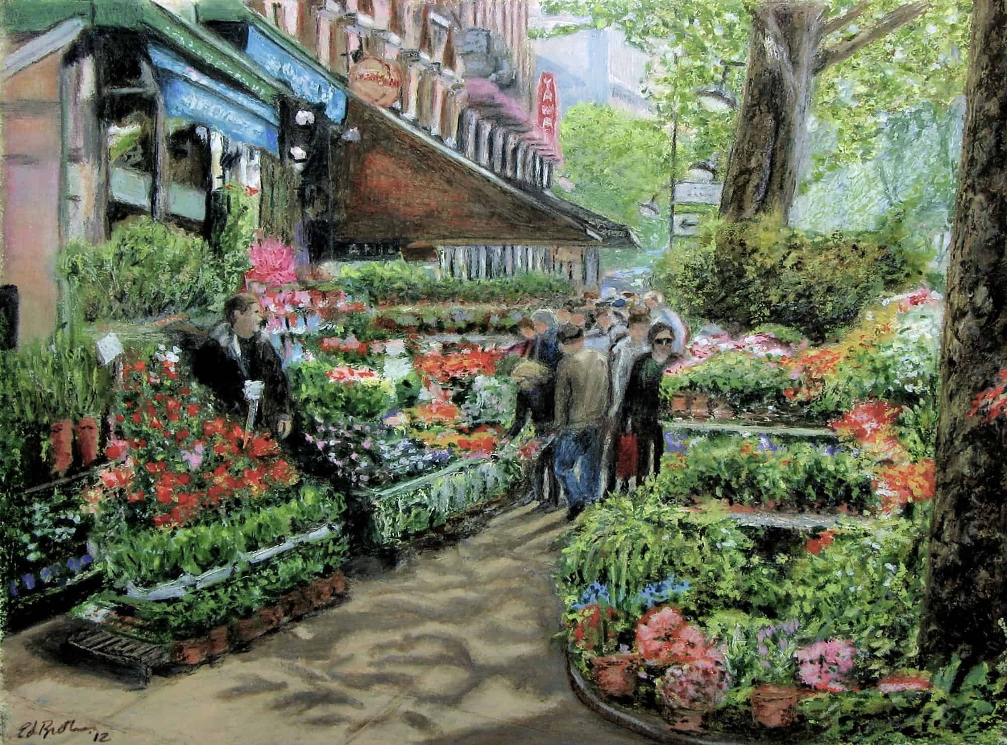
An April vacation several years ago ended with three days in Paris. Among the thousands of photos from that trip, one was bursting with the color of flowers and cried out to be transformed into a painting. The image was taken looking northeast, the Seine and a boulevard was on the right, but the area of interest was a row of flower shops and strollers enjoying the morning sun of spring. A few years after completing the painting I was viewing a digital copy of Woody Allen’s wonderful film, “Midnight in Paris”. The first time I saw it was in a movie theater, but it deserved a second and third look. The opening of the movie is a 1920’s jazz soundtrack with an accompanying series of very quick shots taken around Paris. As I re-watched the opening I thought I saw a familiar view. A screen capture and further inspection confirmed it was the exact corner I had painted and from the same point of view. I was shocked, amazed, and pleased. Further snooping on Street View, Google Earth, and other sources uncovered many other images of the same location in different seasons, times of day and night, and from different points of view. The results of my research is a poor substitute for actual travel, but the latter hasn’t been an option for a couple of years. If I ever make it back to that spot, it’ll almost feel like being home.
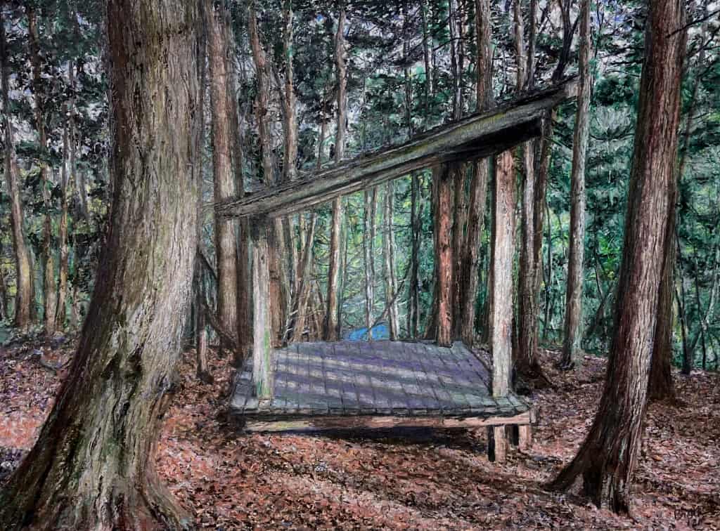
It’s not even New Years and I’m already thinking about what my favorite piece of local woods will look like in March. Fortunately a photo I took last year was available for reference, so I fired up the time machine and jumped ahead three months to this spot near the headwaters of Six Mile Creek. This is the general locality that I’ve depicted in four earlier oil pastel pieces. I hike there often and always see something new that excites me. This particular lean-to is the only structure on the entire locality, except for the wooden boardwalk over the marsh upstream. The lean-to has been there many years, likely updated, since my adult children knew about it as favorite spot during their teenage years well before the establishment of the Roy H. Park Preserve in 2007. What attracted me to this composition, both in the photograph and final painting, is the way the lean-to floor, post and slanted roof line neatly frames the view beyond where the creek can be seen below. The lean-to is a non-natural constructed element, but it beautifully blends into the environment. The foreground trees provide a second frame and add to the depth of the piece. I hope you enjoy viewing the painting and maybe I’ll see you at the lean-to next spring.
I completed this piece several years ago, but it’s an obvious addition to our”tree” show. It depicts a view along the Miramichi River (New Brunswick, Canada) where I have fished for salmon for nearly fifteen summers. Our crew of four is fly casting mornings and evenings, but we take a midday break when there’s time for a leisurely stroll on a wooded path not far from the river. The route gives an occasional glimpse of the rapids and pools, but mostly one just hears the river sounds as they travel through the vegetation. This work is one of my favorites, which is surprising since it only took a few days to complete. The process of creating it was almost like the action of a person possessed and obsessed. I can still hear the river when I look at the painting.
This recently finished oil pastel painting was especially challenging. Faces of people very familiar to me and hands take a lot of trial and error. The small size I work (8.5″ x 11.5″) makes it worse of course. I’m calling this finished for now, but there are still a few things which may get tweaked (again!) down the line. The subjects are four fishing guides in New Brunswick, Canada; at a camp I’ve visited every summer for 15 years. The border was closed in 2020 and this year may be another miss. I have my fingers crossed that a vaccination may be an entry ticket. Some of these guides have been doing that hard work for fifty years. They pole a single angler in 15 ft canoes up and down a mile of tumbling, rocky, private water.They really know the salmon and the river and are a pleasure be with. This is my ninth painting of the area. I hope to get there in the autumn some time to incorporate the colorful foliage.
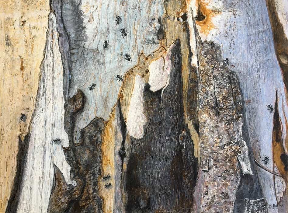
My immediately preceding painting was a detailed street scene with lots of straight line features and strong perspective demands. I needed a break so I chose to do something very different, sort of a “palette cleanser” (pun intended). I settled on a photo I took a year ago while visiting friends in Tasmania. The eucalyptus pictured is right near their front door and the ant infestation was so fascinating I took snaps almost every time I passed it. Sadly, I just found out that the tree needs to be cut down. This is my memorial. My alternative title is “Waiting for Dali”.
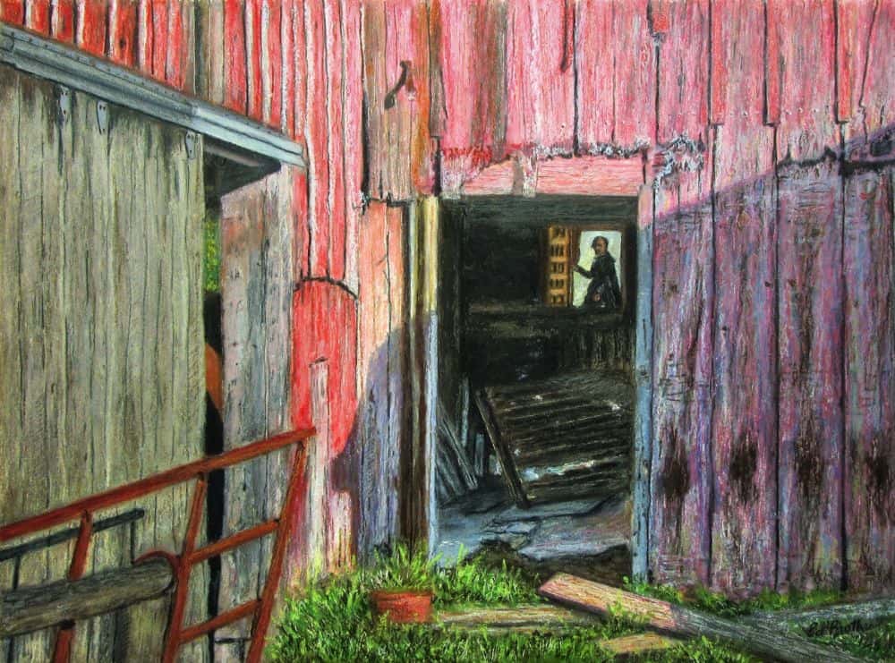
This is my second painting of a local barn and it features a closer look through an open doorway. The composition was not altered from how it appeared in my reference photograph, but fortuitously three significant diagonal features, the rusty gate, the top of the left doorway, and the shadow line from the right, all converged on the open illuminated window visible within the barn. In my photo, there was only some green weeds present beyond the window. This seemed inappropriate for a focal point of the image, so I pondered with playing around and considered a fanciful addition. Maybe some memories from an art history class many years ago sparked a realization that the placement of the open window resembled a feature in the Velázquez’s masterpiece “Las Meninas” (The History and Mystery of ‘Las Meninas’ by Diego…) . I knew immediately that the mysterious figure in the doorway of his painting belonged my in barn window. I was very pleased with the addition, and after the painting was completed I did a search to see whether my inclusion of the doorway figure was original. Of course it wasn’t. I must have had subliminal memories of other artists (Picasso, and Dalí in particular) using a Las Meninas theme, composition and figure(s) in their own paintings. In fact, there is an incredibly rich history of many artists doing this (covers & citations » Diego Velázquez, ‘Las Meninas,’ 1656). I guess it’s difficult to be original these days, but I’m happy to be a very small part of an artistic tradition.
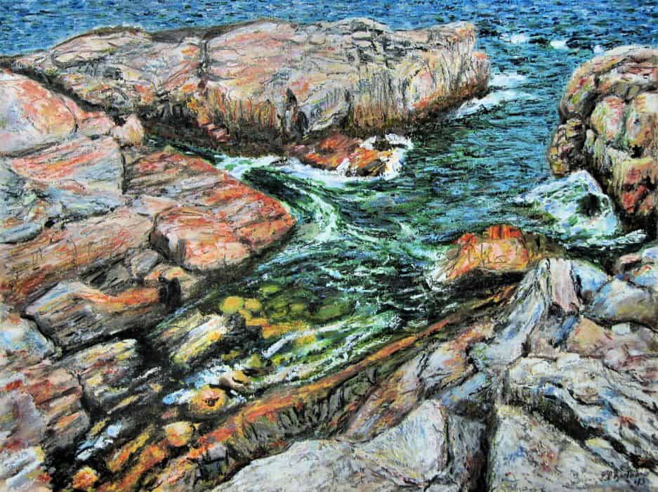
Intersections, as I use the word here, refers to cross-connections between locations such as streets, or larger categories such as islands. It can also refer to the connections, intentional or otherwise, between artists. This post will connect five images from different times and places. The painting shown above is of a location on Appledore Island, Maine. This small island is the site of the Isles of Shoals Marine Laboratory which is an educational and research facility now jointly operated by Cornell University and the University of New Hampshire. Appledore Island also has a rich history in the late 19th century as a summer gathering place for artists, including the American Impressionist Childe Hassam. I’ve always had a fondness for Hassam’s cityscapes and seascapes. I was fortunate to make many trips to Appledore while I was teaching at Cornell. When I started doing oil pastel paintings about 15 years ago, I had the thought that I’d try my hand at an Appledore seascape, but it took me many years to get around to it and also obtain a reference photo to my liking which was produced on my last trip to Appledore. While working on the painting, I made a conscious effort to loosen my technique to pay homage to Hassam’s style of brushwork. The painting title is an expression of that effort.
A couple of years ago I decided to determine the exact island location I photographed and painted, but more importantly, determine whether Hassam had painted the same spot. I enlisted the help of a friend (Dr. Hal Weeks) who has taught on Appledore for many years and has also catalogued all of the island locations of Hassam’s paintings. This was a painstaking effort, but the results were included in a museum show a few years ago. Hal’s determination was that the location I painted is a geological feature now known as Broadway and 42nd Street. This is not a name used in Hassam’s time. It also turned out that Hassam painted the same area (although from a different point of view) and called it “The South Gorge”. Here is his painting and a recent photograph for comparison.
Now it gets interesting. Hassam painted many cityscapes, including some very well-known ones, in New York City. One is titled “Broadway and 42nd Street.” Here it is:
Childe Hassam-Broadway and 42nd Street
Just to complete the circle in this discussion, I did a cityscape a few years before the Appledore painting. The location is NYC and it shows the intersection of Broadway and Spring Street. Too bad I didn’t chose a location further uptown.
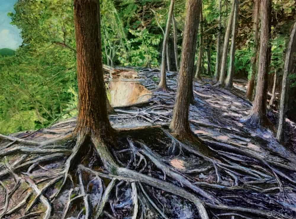
I had a difficult time deciding on a title for this new painting. Some of you might recognize the location as a Fall Creek cliff near Varna. I’ve walked past this spot many times, but the lighting on one particular day highlighted the complex root pattern in a way I knew I had to paint. Trees are now thought to communicate (“The Hidden Lives of Trees, What they feel, How They Communicate” by Peter Wohlleben) via chemicals, hormones, and electrical signals produced by fine root structures (mycorrhizal network) and associated fungi. It’s a form of social network on the “wood-wide web.” If you’d like to learn more, read the book or a shorter descriptive article in Smithsonian Magazine (https://www.smithsonianmag.com/science-nature/the-whispering-trees-180968084/). Of course, the active elements in this web are subterranean, but the exposed roots here are intriguing as an artistic element. I also found the drama of the scene compelling. These trees are on edge of a cliff, and some are already beginning their descent to the creek bed. The life of these trees are already beginning the final lean over the precipice, eventually to be followed by a swift tumble to the waters below. Roots are a metaphor for history and stability, but this scene illustrates that a process is already in progress which cannot be resisted indefinitely.